The Challenge
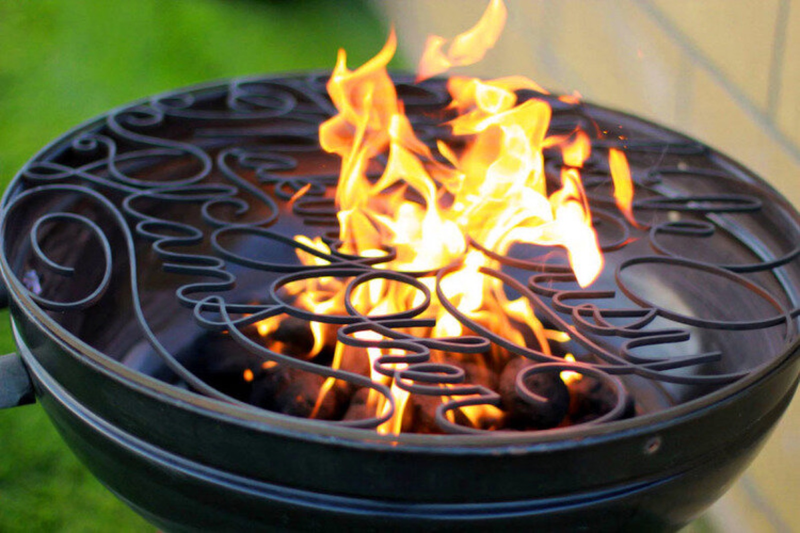
Create a print identity with real character — something that feels hand-built and confident on paper, from vector marks through final press.
Approach
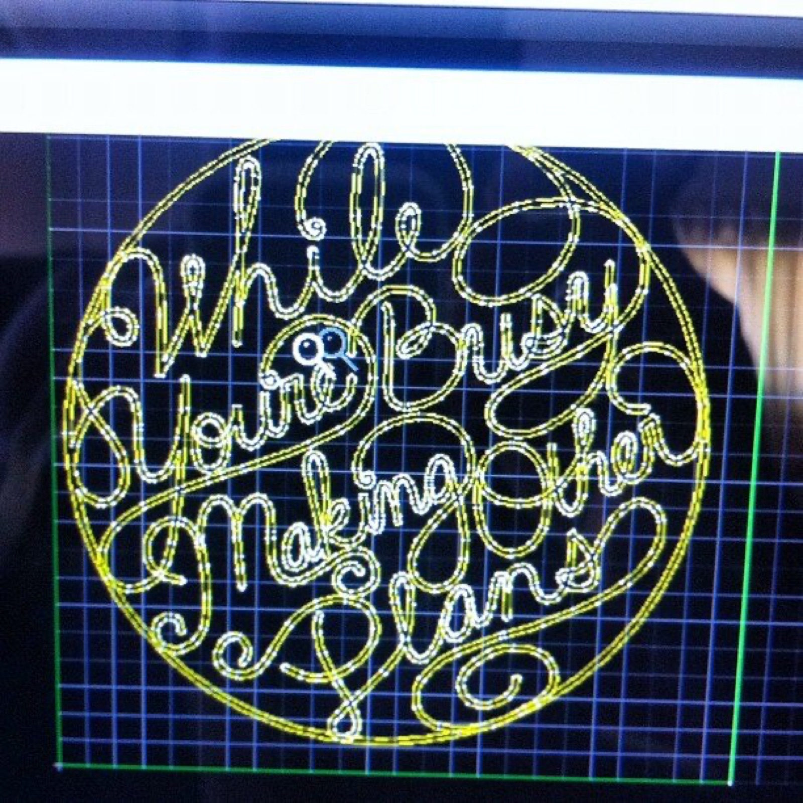
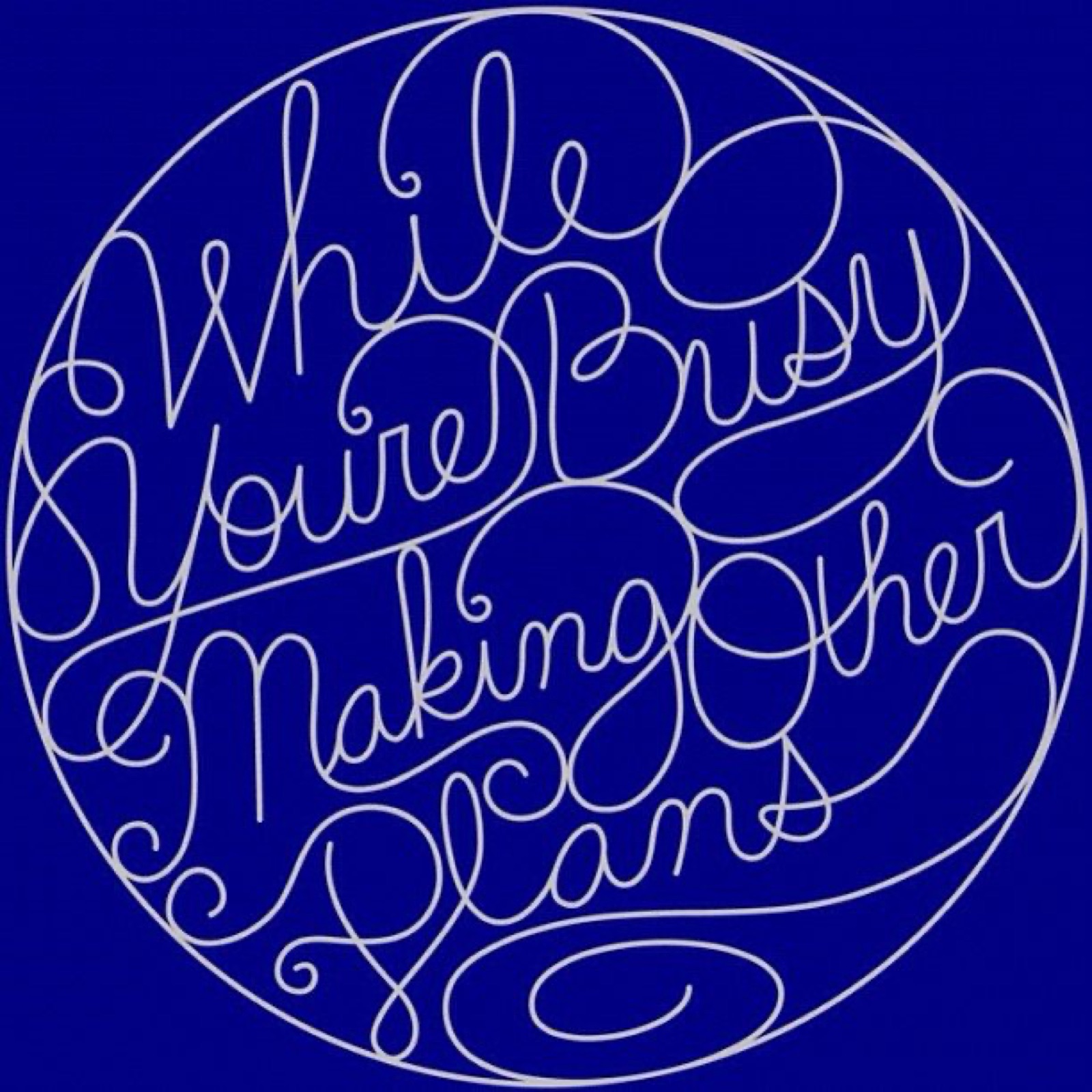
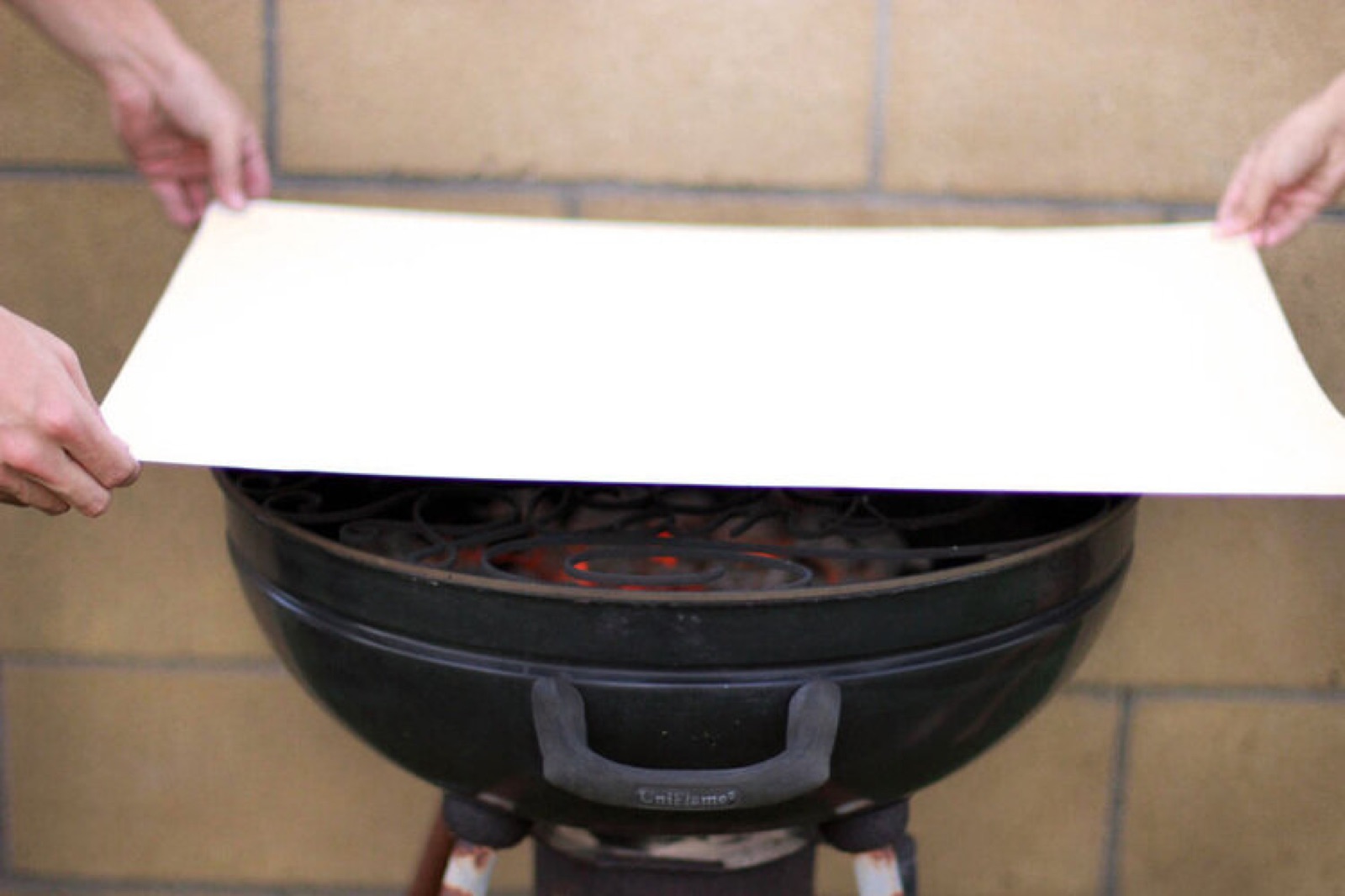
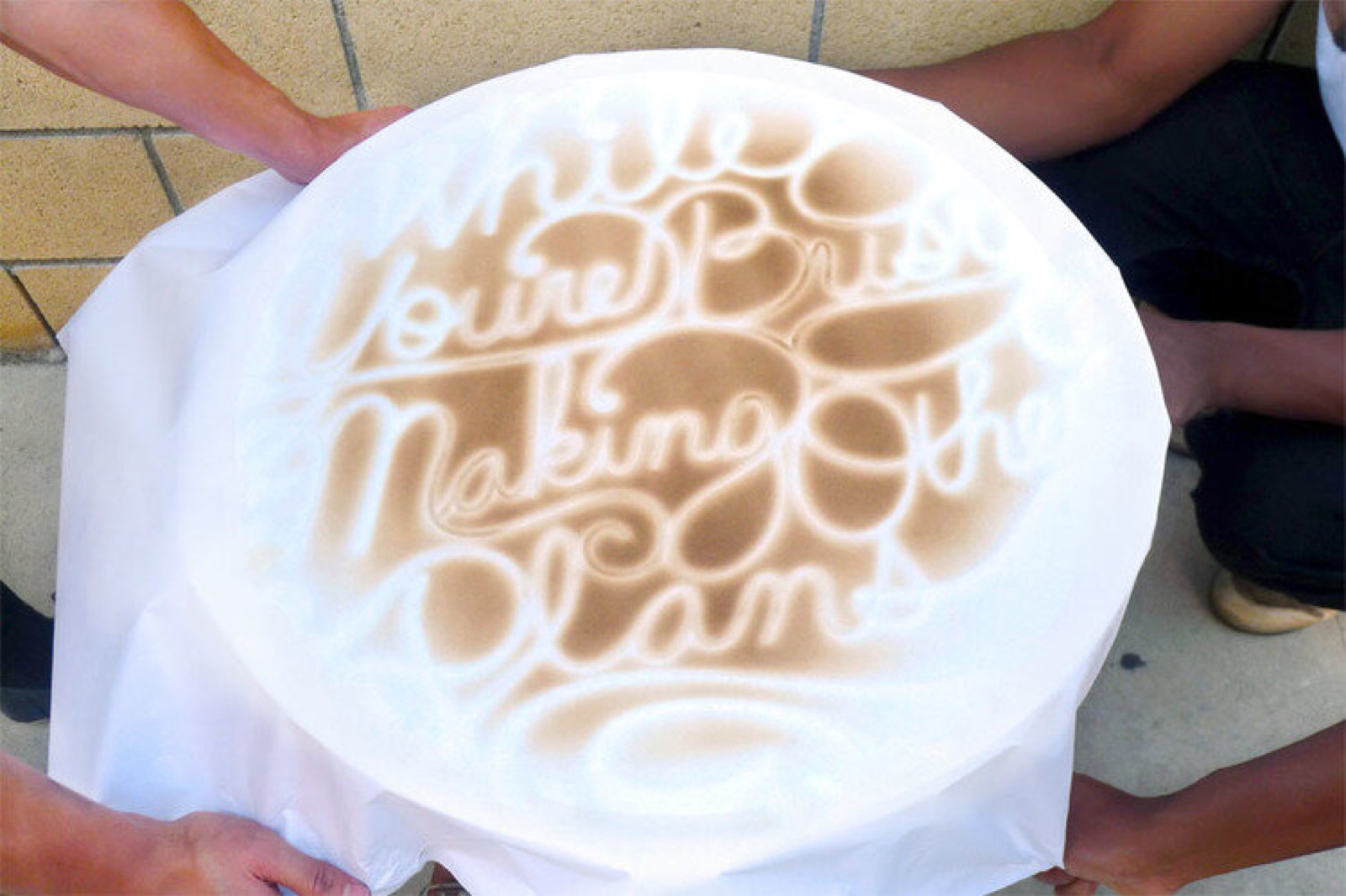
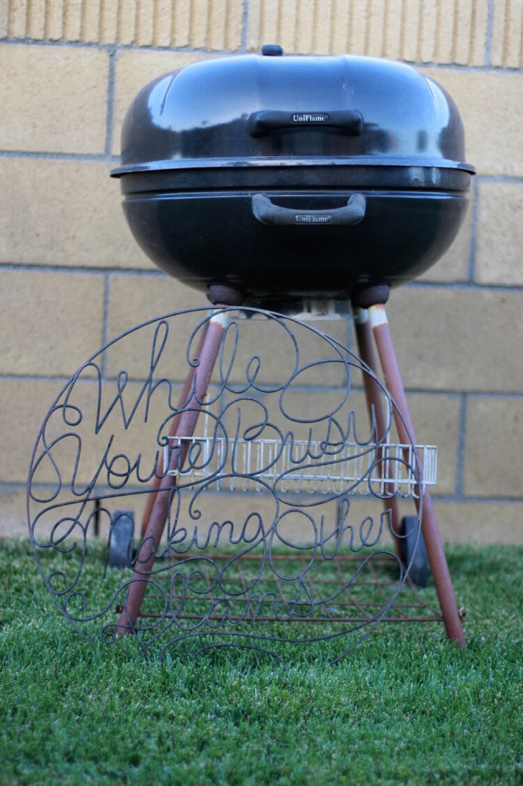
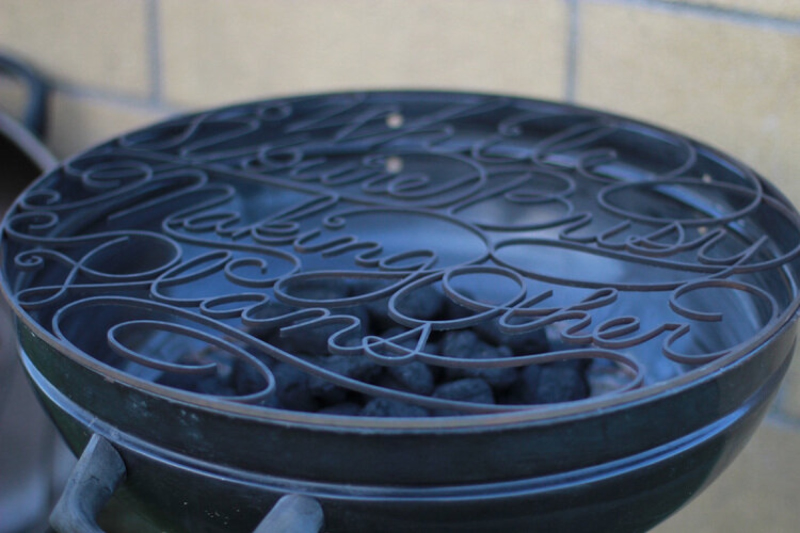
Starting from loose sketches, I refined the marks into clean vector artwork built to survive the press — strong silhouettes, high contrast, no fragile details. Each piece was proofed physically, not just on screen.
Outcome
A cohesive set of printed pieces with a strong graphic voice — work that holds up in the hand as well as on the screen.
What I Did
- Logo and mark design.
- Vector illustration and cleanup.
- Print production and press checks.
- Art direction across the printed set.